


Julep was another Nail Polish company that I Art Directed for, with a primary focus on packaging and creating more engagement with their subscription customers.
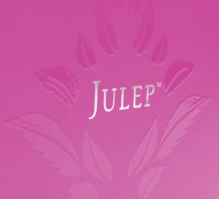
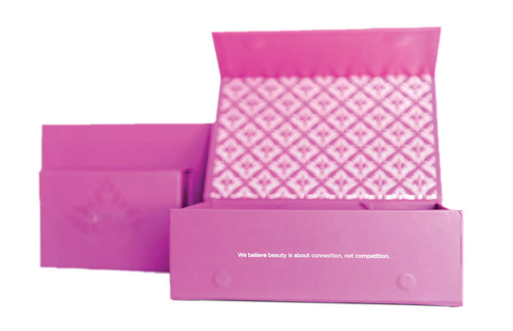
Julep had red cardboard shippers with a ‘leafy / tulip’ icon floating around by the wordmark. My goal was to elevate the customer’s experience when they received their orders. I dove into the word ‘Julep’ to see what I could find: at the Kentucky Derby, mint juleps are served in silver “julep cups”, garnished with mint, and are symbolic of socializing and gathering for a good ole time. Julep’s best selling nail polish was a hot pink…I created a floral / damask pattern for them, and added handwritten elements to give things a more personal touch. I sourced flat-pack boxes that could easily be warehoused, and fought for magnetic closures to elevate the feel of the new containers.
Now we had nice shippers and boxes, we had to fill them with pretty products! It was my role to work directly with the product development & marketing teams to create luxury packaging, components, and digital imagery for the brand. I overhauled the nail polish packaging, and created their best selling to date holiday offerings. During my time as A.D, we tripled our subscriber numbers.
Another interesting project was designing packaging and digital marketing for Julep’s new invention, the long bendy finger painting brush. Luckily, they chose to call it the ‘Plié Wand’, which has a better ring to it. Basically, nail polish brushes were magnetized so they could fit to a kind of calligraphy pen, giving the user better control with their non-dominant hand. You know how it is when you try and do your right hand with your left, right? So we needed to show on the packaging how it functioned, its true scale, and as always, keep it luxe.