butter LONDON - Art Director/Designer
A startup nail polish company was born, but she had no identity. The story had to be created from scratch. So who was the target audience, and how could we stand out in such a crowded market? Inspiration came from our love of London, the sophistication of Chanel, and the punk rock attitude of Vivienne Westwood.

Beige on beige wasn’t going to work for us. We needed something that would stand out in a crowded mall or airport. Black. Black is sexy. Gold. Quality. Yellow. Eye-catching. Okay…so now how about some kind of emblem…some sort of quintessentially British icon? Well, we love the Tower of London, steeped in regal history…

"if the Tower of London ravens are lost or fly away, the Crown will fall and Britain with it"
That’s a little creepy…we love it. This is a beauty brand, so let’s make something beautiful to contain our new mascot. The ‘wallpaper’ is born, a mixture of flora & fauna intertwined with jewels and creatures, luxurious and strange.

Now, let’s put this together and see how we compare to our beige beginnings.

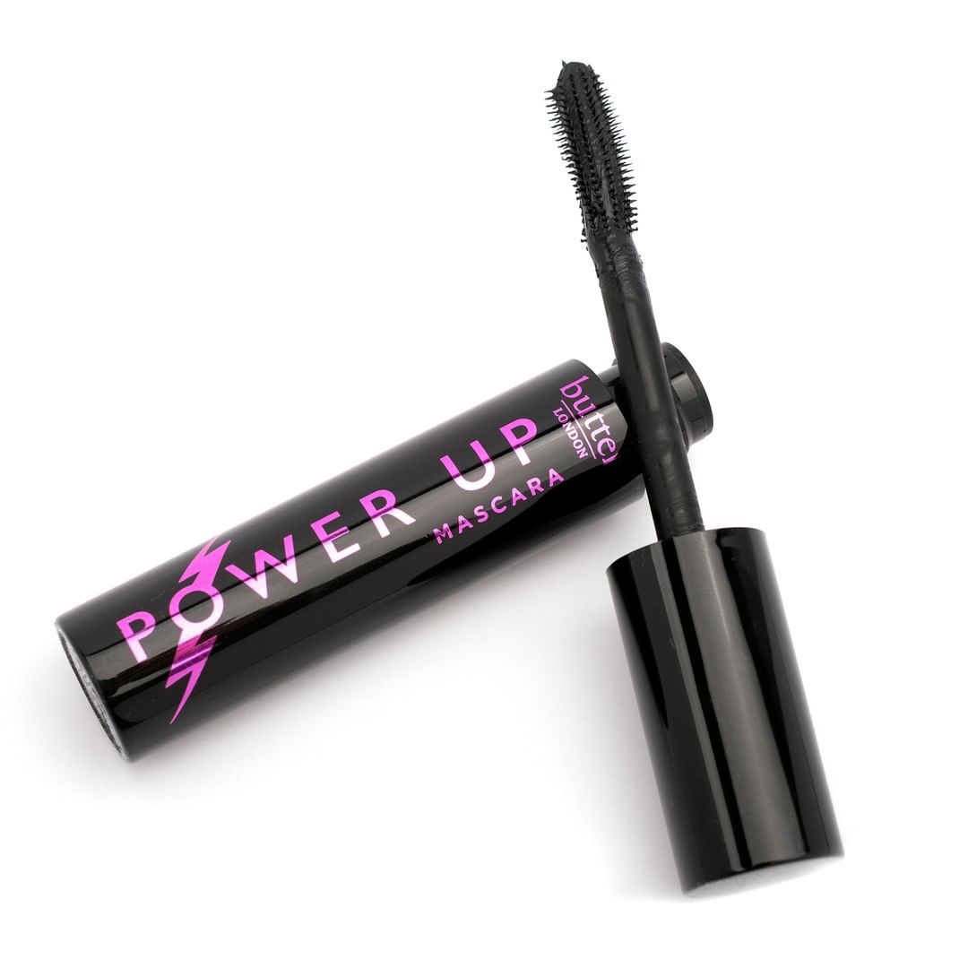
Now that we have our brand identity, we can apply it to our products: Packaging, merchandising, and components.


